Include a Clear Call to Action on Your Home Page

By: Jessica Chestnut
A Call to Action (CTA) is a combination of text, images, and/or other graphical elements that urges a site visitor to take a specific action.
How clear is the CTA on your home page? Go to the home page of your website and assess whether your CTA is clear, specific, and compelling. Does your CTA inspire a user to buy a product, contact you for more details, sign up for your email newsletter, or watch a video? You need to determine what is the most important action for your site visitors to take, and tell them!
Help nudge visitors in the right direction on your site with these tips:
- Keep the CTA above the fold of the home page. This way, your site visitors will be able to spot it immediately, without having to scroll down.
- Use buttons in a color contrasting to the background (over using text) to get attention.
- Keep the clutter to a minimum, particularly in the area directly around your CTA. Negative space around it will help it stand out so the eye will be drawn to it immediately.
- Your CTA button text should be simple, urgent, and action oriented (think �get started today�).
- Size DOES matter. The button should stand out and not be lost in the shuffle of your page. Work to find the happy medium so as to avoid making it ridiculously large as well.
- Express a sense of urgency. Include words in your CTA that will entice visitors to act immediately, such as �for a limited time only�, or �register now -- only five spots left�
- Don�t bombard visitors with too much information. Provide enough info so they will be inclined to take action, but don�t scare them off before they even get started. Also, try to use the home page of your site as the place for the most important action.
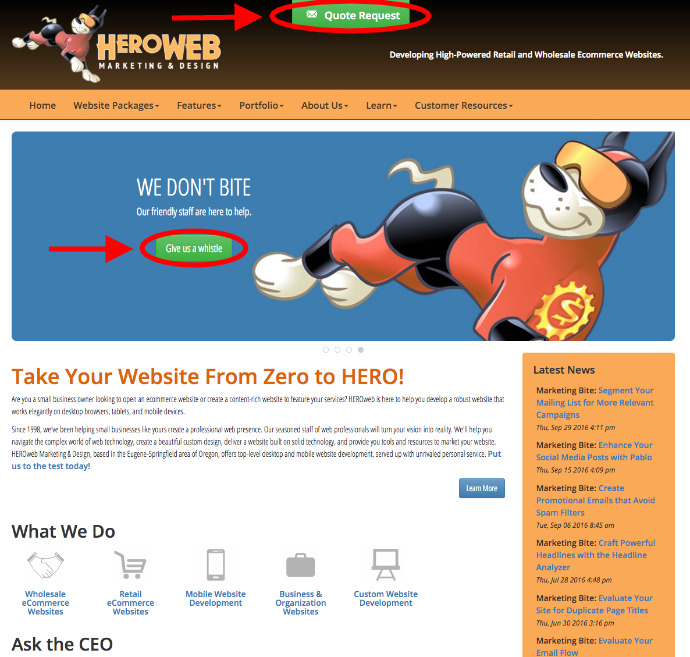
Check your CTA on your home page against the ideas above, then get a friend to check your site as well. See how long it takes them to spot your CTA -- a second set of eyes can help you realize how easy it is (or isn�t) to find. Is your site getting the point across? A clear CTA is a crucial part of any successful website! Take a look at the CTA highlighted on the HEROweb home page below.