
Mobile eCommerce & Website Development
HEROweb presents MightyMerchant Responsive!
 Having a website that works well on tablets and smartphones is crucial for a business' success. Web browsing with handheld devices is approaching the same level of usage as desktop computers. Even Google has indicated they will use the mobile compatibility of a website as a factor in their ranking algorithm.
HEROweb has continued to advance our MightyMerchant platform to meet the needs of a mobile world. Our responsive design framework, which we deploy on every new website, allows you to have a site that works correctly across all devices.
What’s great about MightyMerchant Responsive?
- Optimized: Our responsive sites are touch-friendly, low bandwidth sites, optimized for mobile devices.
- Shared Data: Your desktop and mobile sites share the same data. No double-entry or syncing of data is necessary.
- Support: HEROweb has the friendliest, most helpful staff around! We enjoy working together to help you meet your goals.
-
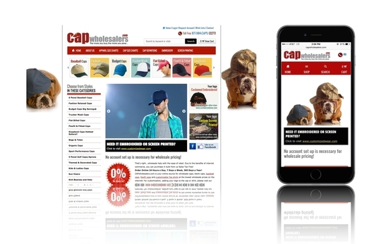
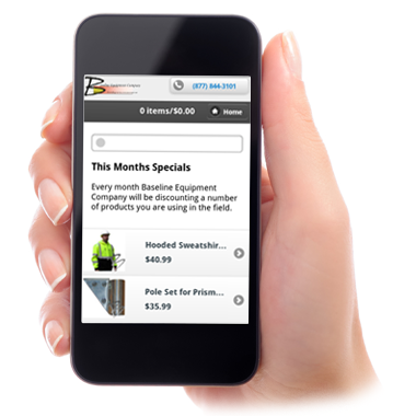
eCommerce Mobile Website
Leverage your investment by having the work you do on your "desktop" website run your mobile site as well. One product catalog, one site manager, one order manager.
Your website (and your customers) will thank you.
-
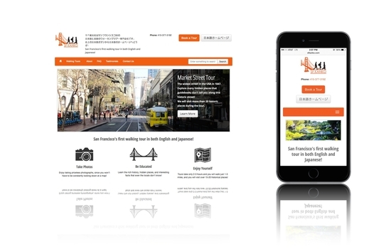
Informational Mobile Website
Provide your visitors with easy mobile access to your web content. Your mobile site shares data with your "desktop" website.